
- The original interface (Click image for a larger view)

- The redesigned Ubuntu Netbook Remix (Click image for a larger view)
I don't hide my love for Ubuntu Netbook Remix, but I'm well aware that the interface wasn't exactly perfect at first. It was clunky and misused screen space, two shortcomings that have thankfully been addressed in the redesign. The right side of the the launcher was removed and integrated into the left panel, and the color scheme was cleaned up, albeit with a slightly darker tone. As it stands, the new interface is sleek, sexy and feels more responsive.
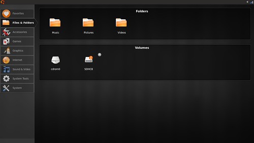
- UNR now lists the folder shortcuts and drives in the left panel. (Click image for a larger view)
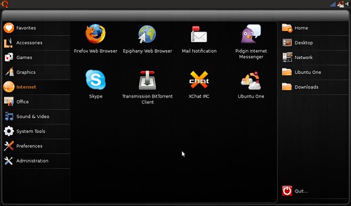
- Each icon now has an "Add to Favorites" menu button. You no longer have to drag and drop it into the "Go Home" applet to create a shortcut. The integration of the Ubuntu notification system is also a nice touch. (Click image for a larger view)
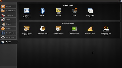
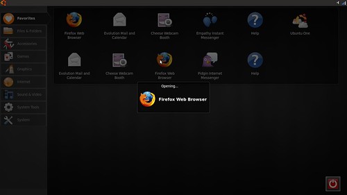
- The preferences and administration tabs were merged into the System category. This seems like a minor tweak but allows users to find everything they need to configure or edit their system in one tab.
- The launcher was changed. It no longer animates and has a sleek look that fits in with the tone of the redesign. It's faster and less distracting, a definite plus in my book. (Click image for a larger view)
I've already written about the exciting improvements in-store for Ubuntu 9.10, and Ubuntu Netbook Remix's redesign is making the wait unbearable.
| Have a question or problem that this article doesn't cover? Ask our Ubuntu Mini 9 Google Group for help. |
16 comments:
Now interface looks more like xPUD Linux.
The older interface was a good first attempt, I disagree that it wasted screen space. I make common use of the favourites tabs for almost all my used Netbook apps and have 1-click access to file functions. The screen shots there show file function access is now 2 clicks away and replaced with lots of unused space, that's not an improvement.
It would be nice to see that wasted space used for some integral PIM functions and web-app integration like Moblin and JoliCloud.
I'm liking the high-contrast theme though, useful when on low-brightness mode.
Why do each of the icons appear twice? Is that a bug?
I have to agree with Dave. I loved the fact I could access all of my commonly used folders with one click.
Also, I'd like to see something like Moblin's Calendar/schedule planner integrated into the homescreen of the UNR.
By the way, I just saw Jolicloud. Looks very nice!
It looks nice, it's a shame that I've never had the chance to try it.
perhaps, one day, I'll can lend a mini-laptop to testdrive Ubuntu Netbook versions.
I really like it.
NBR came pre-installed on my System76 Starling, and the icon zoom-and-spin effect when I launched an application made a GREAT first impression! I will be sorry to see it go. Could we keep it as an option? Pleeeeze?
And am I the only person who used right-click --> Add to Favorites in the current NBR? I didn't even KNOW you could drag-and-drop. :-)
I do like the new visual theme, and +1 for the concept of putting a PIM on the home screen. And I like getting more icons on the screen at the cost of moving file functions to the left menu. So overall thumbs up.
I'm with GF Rice - I've always used Right-click Add to Favorites and didn't even know you could drag-n-drop.
I'm not a fan of some of the changes either. This new format seems to have more wasted space and requires extra clicking. Getting rid of the icon animation seems pointless too.
Any word on whether it plays nice with Compiz?
why would you use UNR and compiz together on a netbook? I like pretty but I also like performance.
Nice job sidestepping the question, I will take your answer as a "no" then ;)
And I too like both pretty and performance, and switch between UNR and Classic. I should clarify my question: I don't want to use UNR -with- Compiz, however, there are issues switching between UNR and Classic+Compiz. Whether you're using Desktop Switcher or the fast user switcher.
I didn't sidestep, I just didn't understand you. I switch between UNR and the standard Ubuntu Desktop and run compiz without a problem in Jaunty.
The desktop-switcher WAS broken and I wrote an article about the proposed fix. That fix got merged into Ubuntu 9.04. The complaints about it have died down since then on the site & google group.
I switched a couple of times in Karmic and didn't have any issues but it's alpha and probably will break. That's the point though. If your running Karmic stuff will break.
re: why run both UNR and Compiz:
I have seen it asked here how to have UNR and multiple desktops without compiz, for example (I don't recall seeing an answer).
I put on Compiz and disabled the window effects that broke/ made high CPU and use some of the shortcuts. My install seems snappy to me.... perhaps I should test further, but there does not seem to be a need to at the moment.
The User Interface as of Alpha 4 is even better, the color is now a brown/orange with a transparency so that the desktop shows through, and the top bar icons are light gray on black. Awesome.
I'd like to second that the 'improved' 9.10 UNR interface is actually much worse than 9.04, which pretty much got everything right.
I *want* the folders pane on the right-hand side for one-click access.
Merging Preferences and Administration into System means I now have to scroll down to get to Administration that I could previously get to in one click. Scrolling is very expensive on my Acer Aspire One with no mouse - I basically have to touchpad-mouse over to that tiny right-hand-side scrollbar and click. And the interface doesn't respond to PgDn for scrolldown either. That gets up to ten seconds or more compared to one click.
Lesson: wherever possible on a netbook, keep everything on one screen.
The 'power' button is now gone completely. That was a feature! How am I supposed to shut down now?
Making the background grey rather than black draws attention to the irregular size of the black box which varies depending how many icons are in a pane. That makes it less sleek, not more.
Oh, and the top bar icons being now black is pretty horrible - I can't see what my open taskbar apps are unless I individually mouseover each one. Again, on a tiny netbook touchpad, not something you want to be doing a lot of when you could just glance at the screen and see in full colour what you were running.
So far I'm very disappointed in 9.10 UNR. I'd really really like to revert the home screen back to the 9.04 version; I'd even consider reverting the whole OS back to 9.04 and reinstalling from scratch as usability has taken such a huge hit.
Change sometimes sucks. Look at KDE4.
Post a Comment